Overview
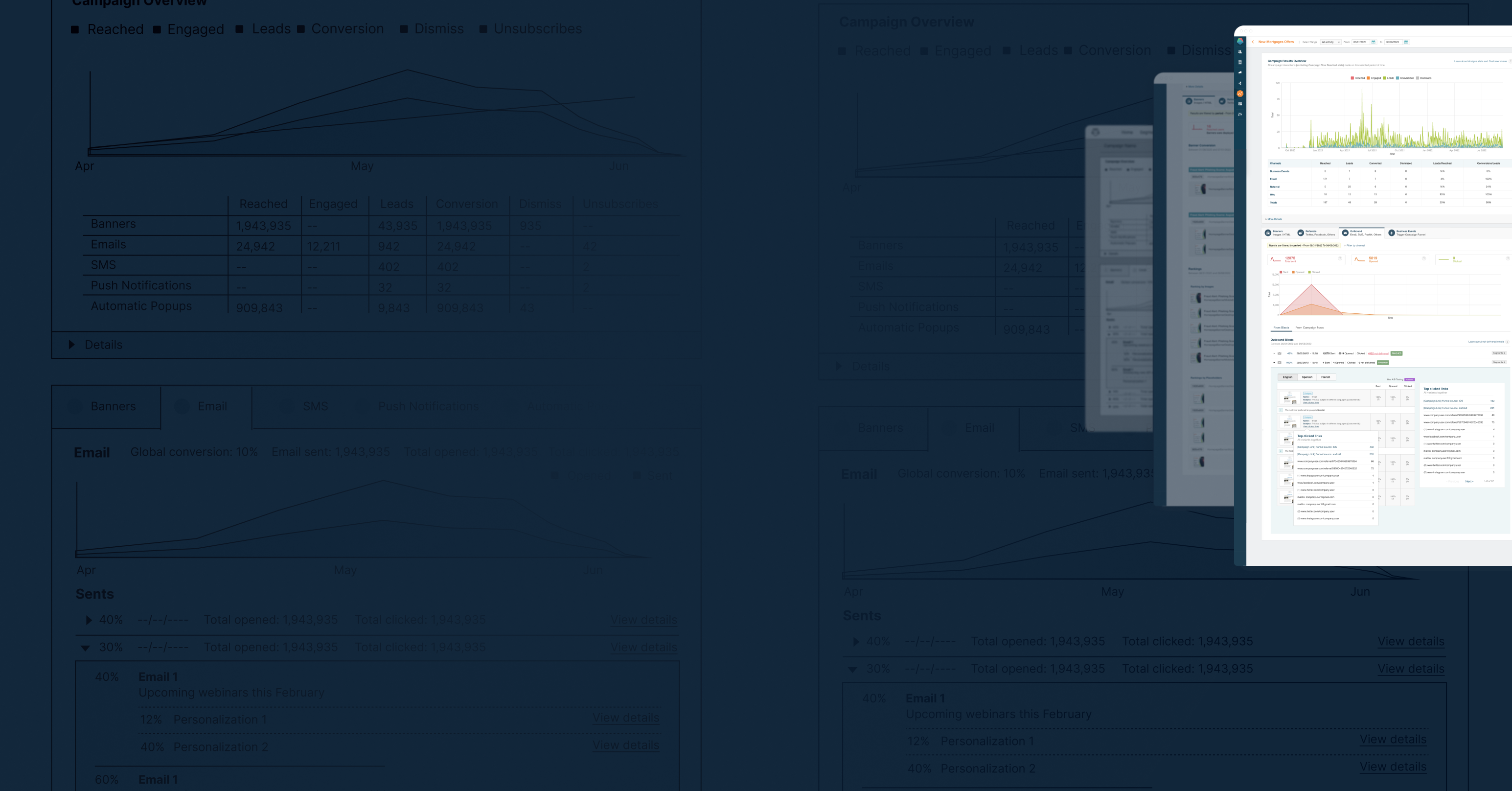
Prisma Campaigns started as a tool for banks, allowing them to easily personalize and send marketing campaigns using their data. Once the campaigns were executed, the tool provided feedback to their own systems to improve upselling, cross-selling, and share of wallet strategies.
Goal
Get insights from performing marketing campaigns to optimize their results.
My Role
Responsible for the entire design process, from research to final execution.
Target Audience
Marketing Specialists & Data Analysts
Problem
Inefficient processCurrent methods for analyzing marketing data are time-consuming and complex. User needs to download a .csv and use an external tool to analyze data.
Lack of actionable insightsNo easy access to the performance data of campaigns for effective decision-making
Missed opportunitiesNo visibility of issues or campaign performance while they are running.
Solution
Design a real-time data analysis feature that allows our customers to identify issues and adjust strategies on the fly, through easy exploration and interpretation of campaign performance.
Process
Using problem-solving techniques like human-centered design helps me a lot to put the user at the center of the process, and focus on the users' wants, pain points, and preferences on each part of the process to achieve the best result.
On this project, I chose to conduct qualitative research, as I wanted to understand their concerns and needs.
In the interviews, I asked questions like:
- What challenges do you encounter when analyzing marketing data?
- Can you provide examples of specific metrics or KPIs that are critical to track in your marketing efforts?
- Can you describe your current process for analyzing marketing data?
- What tools or methods do you typically use?
- How often do you evaluate the effectiveness of communications?
These questions provided the initial input for me to start the process of defining the problem and proposing a possible solution.
Interviews
1-1 Zoom Meetings
Customers
10-15 customers
Time
2 weeks
Based on the interviews, I created a Perspective Grid on the Solution Space to represent the problems our clients experienced and the opportunity for improvement.
This not only helped me with the process but also allowed the stakeholders to empathize with our customers needs and problems.
Throughout the research, I noticed different profiles of the people involved.
In order to move forward with the process, I defined these to target our solution.

Marketing Specialists
Balancing creativity with data-driven insights, staying ahead of trends, maintaining brand consistency across various channels, and proving the impact of creative campaigns. Their current process is:
- Manually collecting data from different sources which is time-consuming and prone to errors.
- Using basic tools like Excel spreadsheets to organize and analyze the data.
- Lacking proper training in data analysis which hinders their ability to make informed decisions.

Data Analysts
Highly analytical and relies on data to make informed decisions. They have a structured process for analyzing marketing data, which involves:
- Cleaning and organizing the data to ensure accuracy and consistency.
- Analyzing the data to identify trends, patterns, and insights that can inform marketing strategies.
- Presenting findings to key stakeholders and using data-driven insights to optimize marketing campaigns.
Conceptualization
My goal was to involve customers in every part of the process, so in each cycle, I presented the new designs to the group of customers to assess whether we were on the right track.
Prototypes
Low fidelity mockups
# of Iterations
3
Time spent in total
2 weeks
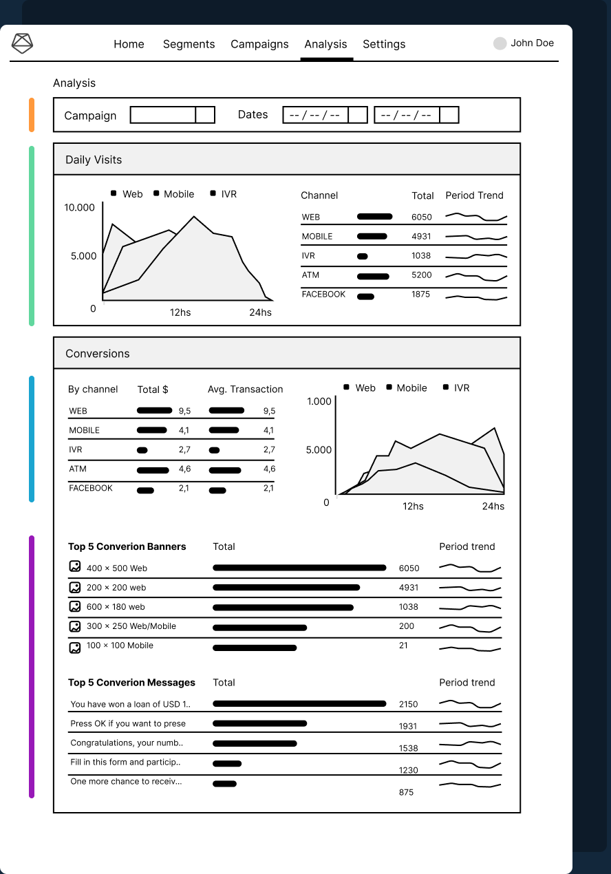
Inspect campaign performance over time
Easily navigate through performances by selecting the campaign and time period.
Campaign behavior throughout the day
- Area Chart (When) series of # of customers vs day hours, showing when users interacts with the campaigns throughout the day.
- Table Data (How) sorted by Channels to identify customers interaction, including total # by channel, and trend for each channel.
Comparative analysis and statistics by channels
- # of conversions and how that translates into revenue & goals for our users.
- Results separated by channel and time of the day users converted
Which communications yielded the best results?
Rankings
- Top 5 Banners (Inbound channel) shown in that period of time and its performance, conversions and trend.
- Emails (Outbound channel) blasted on that period of time and their conversion.
This first stage was truly productive and involved a lot of exchange with the client, where we explored further which elements are truly important to quickly visualize and analyze on the screen.
This is the feedback we consolidated after several sessions with our clients:
- Campaigns might use only one channel, and this layout might look very weak in those cases.
- Lack of general statistics per channel.
- Highlighting campaign status, and all campaign interactions.
- Easier to get a first impression of how the campaign is performing.
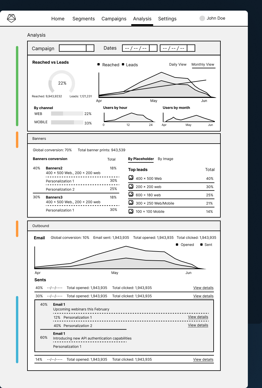
Channels separated on different panels to support more data to review and analyze, and improve scenarios where the campaign doesn’t have multiple channels turned on.
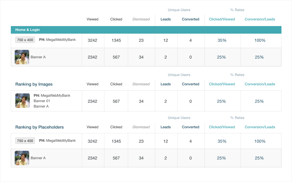
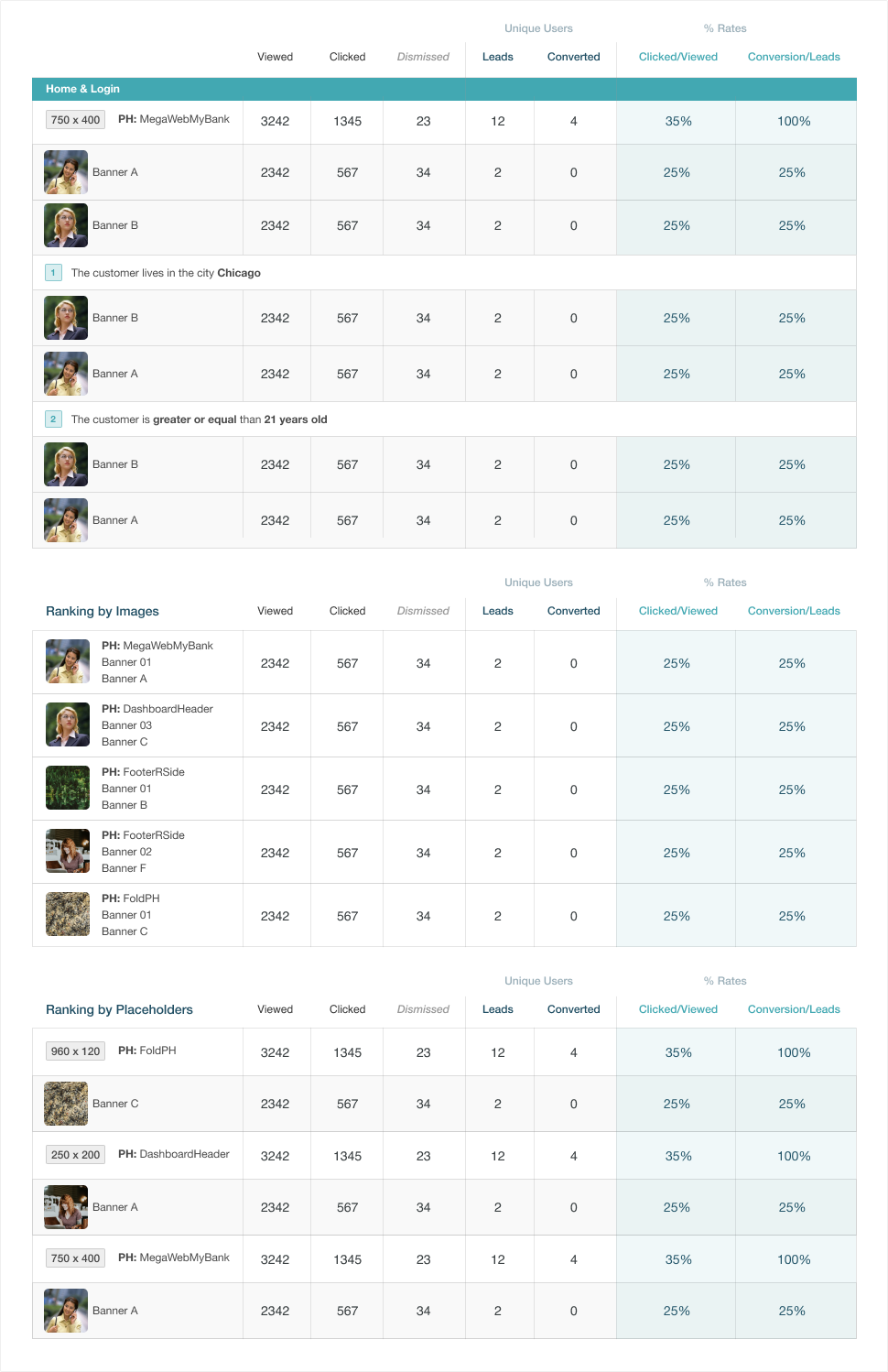
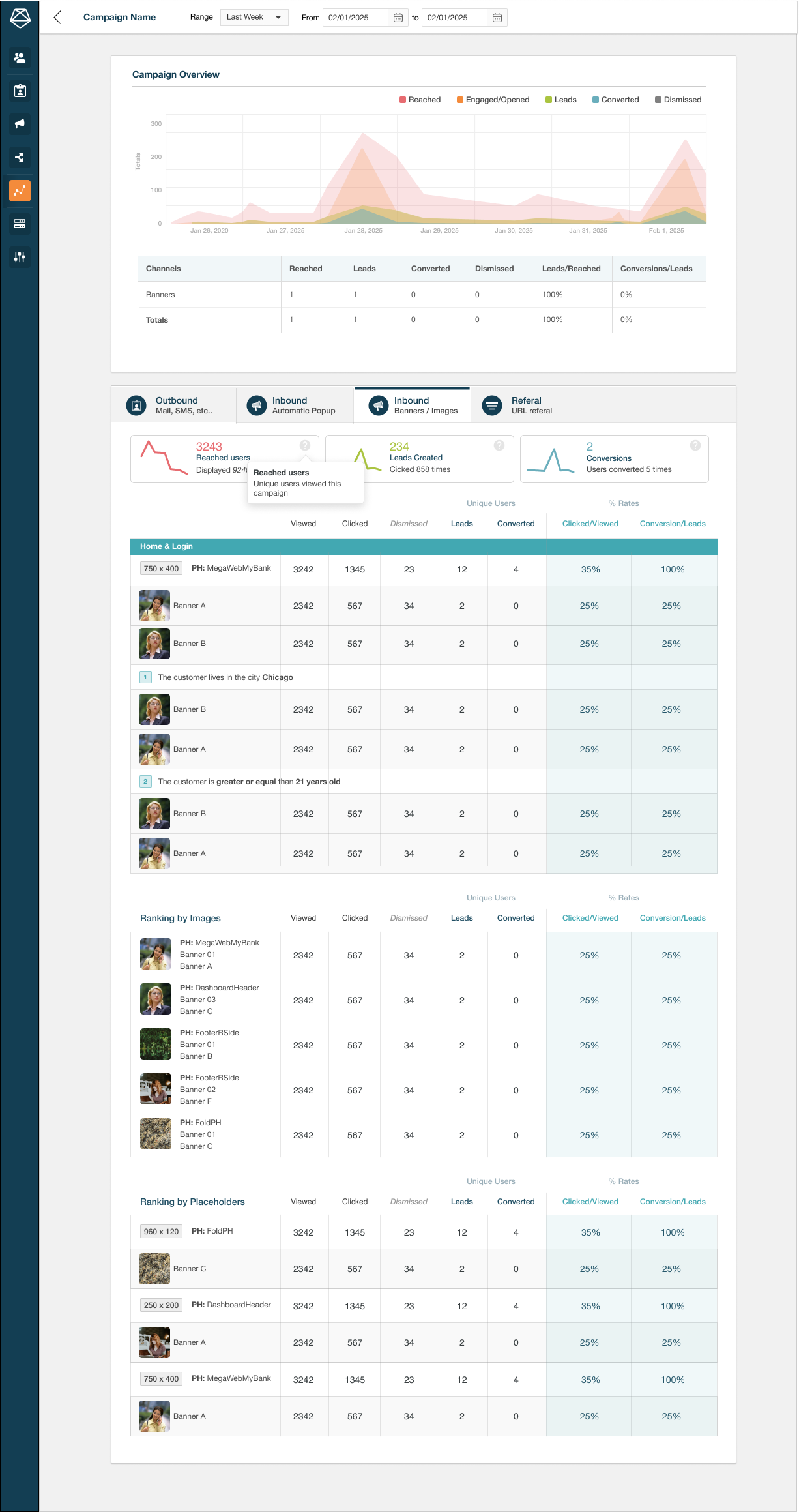
Banners Channel
- Total channel data summary (conversion, banner prints, etc…)
- Banners conversion rate (left) separated by personalizations
- Banners and Placeholders rankings (right) sorted by conversions
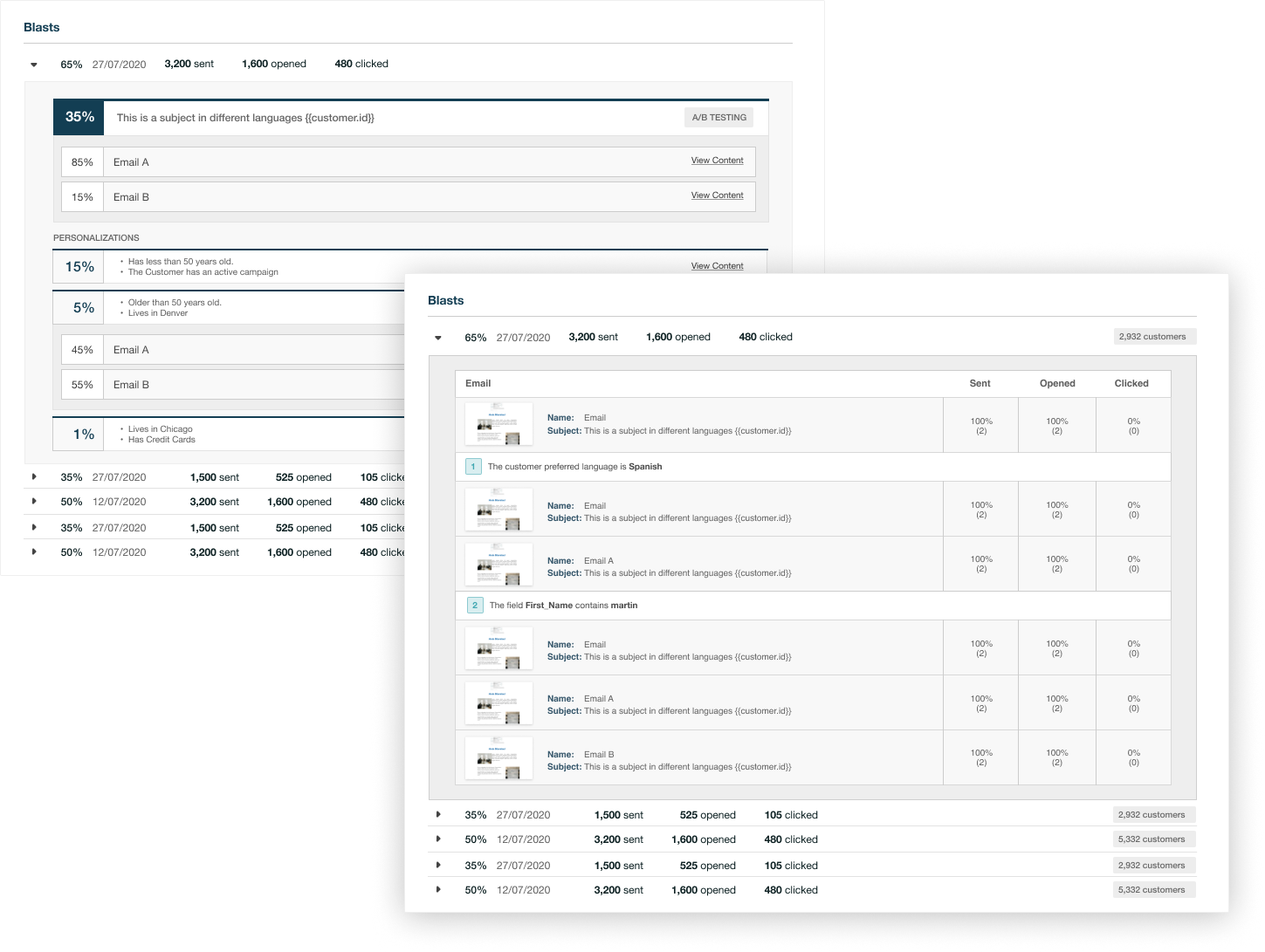
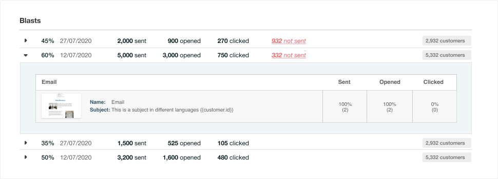
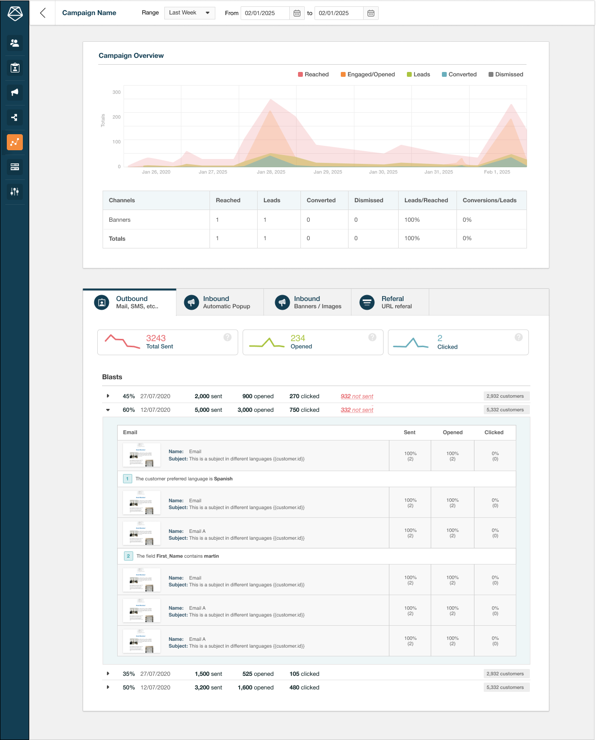
Email Channel
- Chart shows blasts sent during the selected period, and their performance (opened vs sent)
- All blasts are listed with their content sent and their statistics. Each blast can be opened to view their content and details as well if they use personalizations or A/B testing.
Channels turned off
- No stats
.After presenting the new mockup to internal and external stakeholders, all concerns were met and solved.
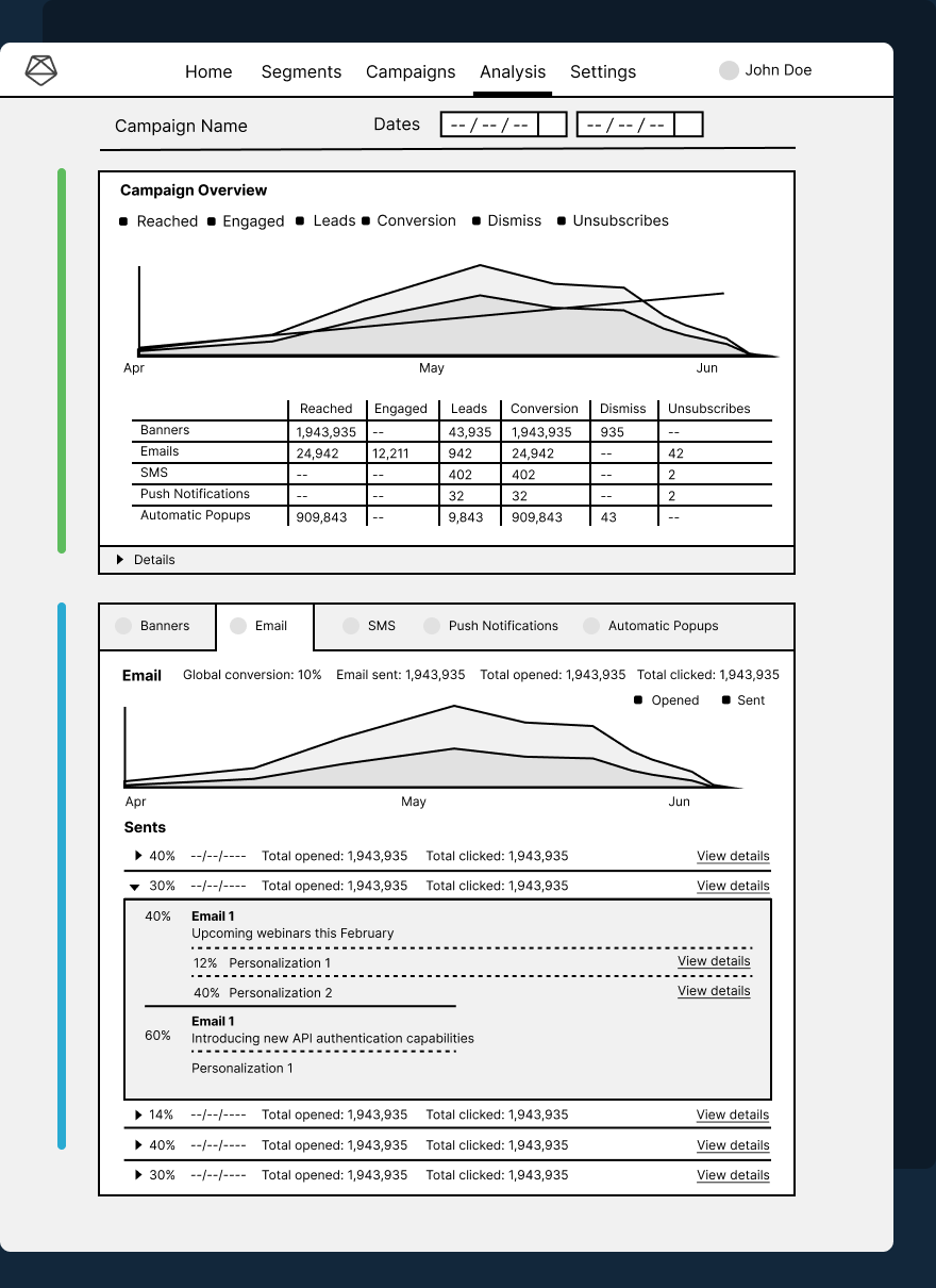
The two more suggestion we received before moving to high-fidelity mockups were:
- Area chart showing campaign behavior and channel data
- Table data with all the statistics shown in the top area chart, making it easy to visualize in numbers how the campaign is performing.
Tab control: allows to easily swap between turned on channels and making it more accesible and optimizing screen space.
Design phases
The first challenge was identifying which method to use for the design.
Since the task involved building a complex page, a top-down approach helped focus on the screen’s purpose, layout, and visual consistency.
At the same time, applying our design system made a bottom-up approach useful for maintaining coherence with other screens and speeding up development through reusable components.
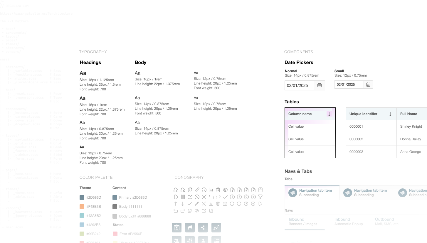
Design System
One of the benefits of having a design system is the ability to build screens quickly and efficiently while maintaining a common language across the application.
In this case, we chose to start the high-fidelity mockups using existing elements and components from the design system, allowing us to easily identify where further work was needed.
The big picture
While the design system is important for building screens, it’s essential not to lose sight of the screen’s overall goal and how all the parts will function together as a whole.
At this stage, starting with the use of existing components, we began addressing the screen’s various challenges, such as how to display the information.
One of the main challenges of this screen is designing it to work both when there is little information and when there is a lot of information.
Make the information fit
One of the biggest challenges was developing the design based on the information to be displayed.
Since our clients vary in terms of size and platform usage, the design had to efficiently and effectively support the display of information for simple campaigns, as well as for complex campaigns.
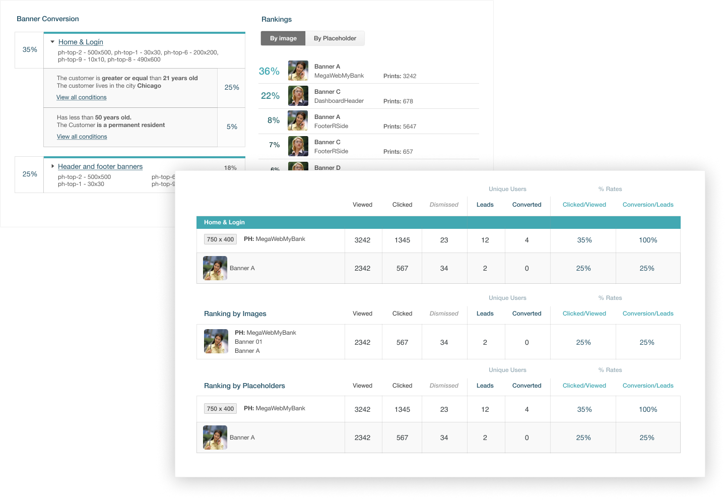
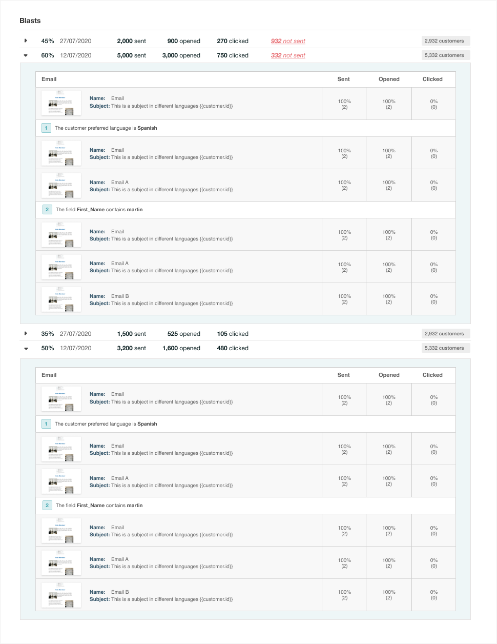
This challenge led to several iterations of the components to support the information in an organized and clean manner, complementing the rest of the screen.
Components
As we created the elements to support the information we needed, the next step was to feed back into the existing design system with new pieces to enrich the platform.
<span class="pe-empty-space" style="height: 100px;"></span>
Final Results
These are the final results of how the statistics for the Banner and Email channels are displayed.
Since the design was intended to scale based on the channels, as clients requested more statistics, these were created and added.
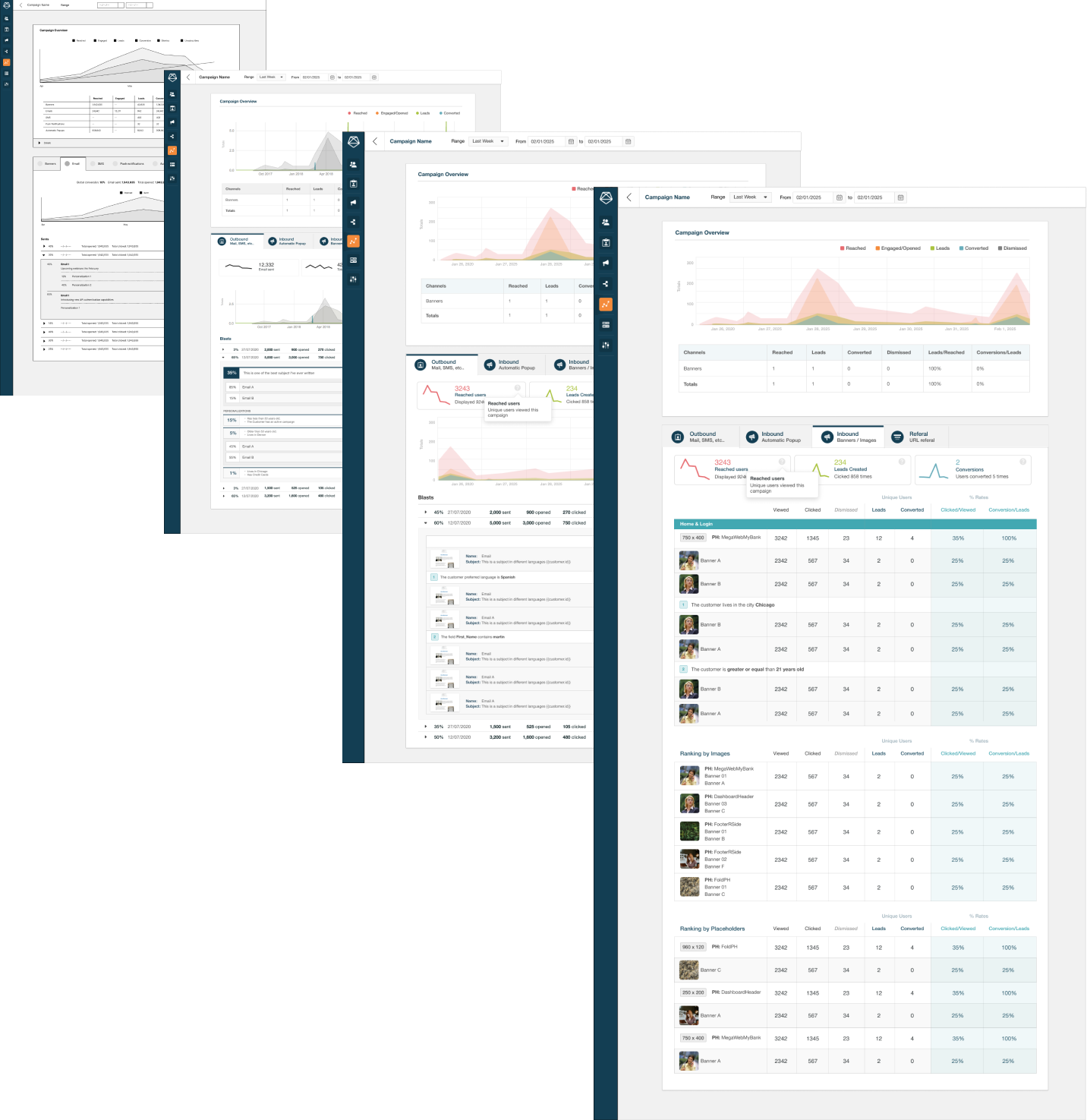
 Evolution file
Seeing Results
We tracked multiple KPIs such as user engagement, user satisfaction, ease of use, and feature adoption. These measurements were obtained through metrics within the product and biweekly interviews with the clients.
Up to 16%
conversion rate
98%
user satisfaction
Increased 51%
open rate
Impactful results
After implementing the new data visualization tool, one of our clients, a mid-sized Credit Union, reported a 25% increase in campaign conversion within the first three months.
The tool helped them identify campaign improvements early, and adjust their strategies in real-time, leading to more effective campaigns.
User-Centric Design
During user testing, we found that some users struggled with navigating all the available data. We responded by allowing users to toggle between detailed views, and this change improved user satisfaction scores by 40% and reduced the average time to take decisions by 30%.
Learnings
The big picture
Designing a feature is not just about solving the immediate user problem, but also understanding the broader user flow and how the solution fits into it in a long-term vision of the product.Document decisions and rationale
Throughout the design process, I found super-useful to document the decisions I make and the reasoning behind them. This not only helps in maintaining clarity within the team and stakeholders, but also serves as a references for future iterations to ensure that everyone understands the 'why' behind the design choices.Design for scalability
It's important to think beyond the immediate needs and consider how the feature might evolve. On this case, the solution is prepared for future enhancements and channel incorporations without requiring a complete overhaul. This forward-thinking approach adapts to user needs changes and market conditions